

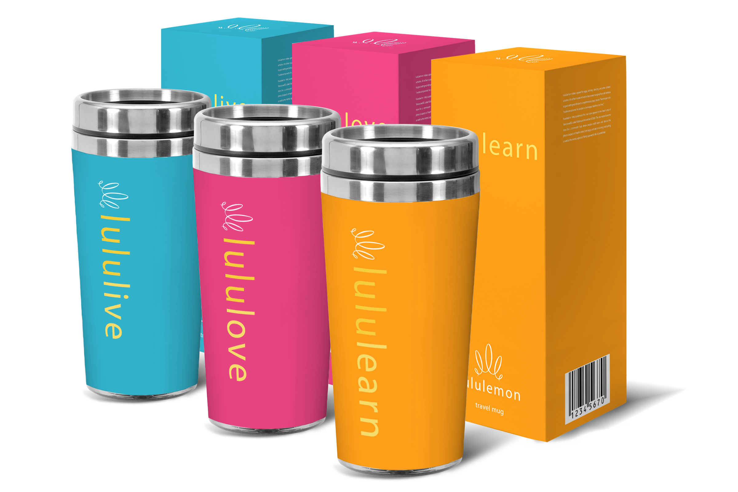
Brand Design
LuLuLemon was founded in 1998. The idea was for the store to act as a community hub where people could learn and discuss the physical aspects of healthy living from yoga and diet to running and cycling as well as the mental aspects of living a healthy lifestyle.
Leading a healthy lifestyle is difficult and most people can’t do it without a strong support system. The community aspect of this brand is what separates it from other companies such as Gap and Forever 21, and yet we see very little of this on their promotional materials. Being alongside others who are facing the same challenges gives people hope.
If their brand is centered around this community of people trying to exercise and live a healthy lifestyle then the brand needs to celebrate their diversity and speak to the motivations that they all have in common. Broadening their appeal to a larger audience will give them a much needed boost to their profits. Companies like Old Navy and Athleta found a great deal of success doing just that.
I tried to explore the type as a visual element and experiment with the negative spaces between the letters. I also explored symbols common with wellness and yoga such as the lotus flower, the hamsa symbol and the mandala. When it came to color, I explored colors that one might find in serene and peaceful settings like a sunrise or a misty morning on a lake.