
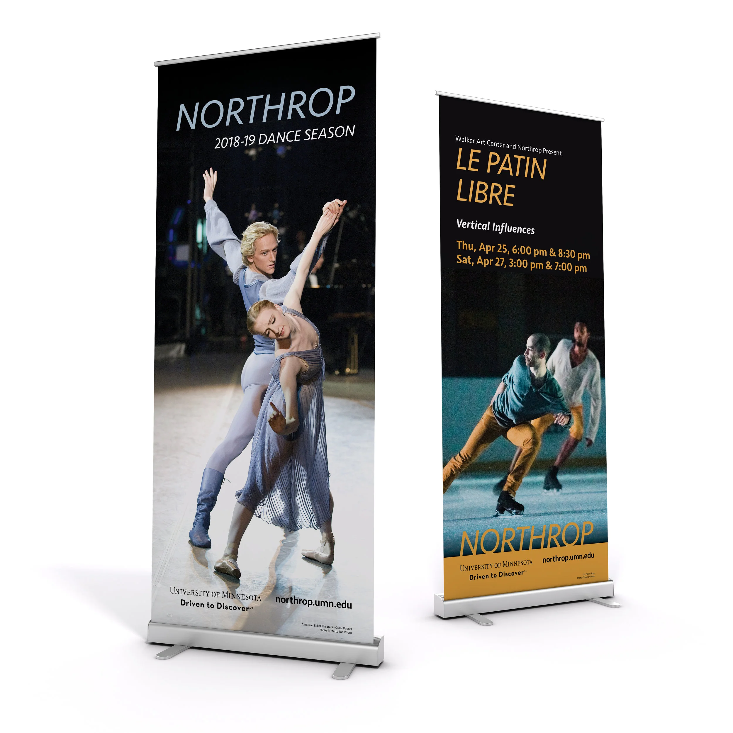

Since many of our marketing materials are show specific, I created a smaller palette for each performance and then a broader palette for the more general marketing materials. The smaller palettes are more effective when the posters and banners for an event are on their own, such as a bus station ad or a large banner. The more general palette was created for consistency, but was still very adaptive and worked well with a variety of photographic styles. I was only given one typeface to use, so I used scale and color to create interest and a more effective visual hierarchy. The photography I was able to use depended on the company or artist that would be performing, so I worked closely with their marketing teams to get the best possible assets that we could use.